Animated modal in React using — onAnimationEnd
August 12, 2023
upd: February 6
3.2K

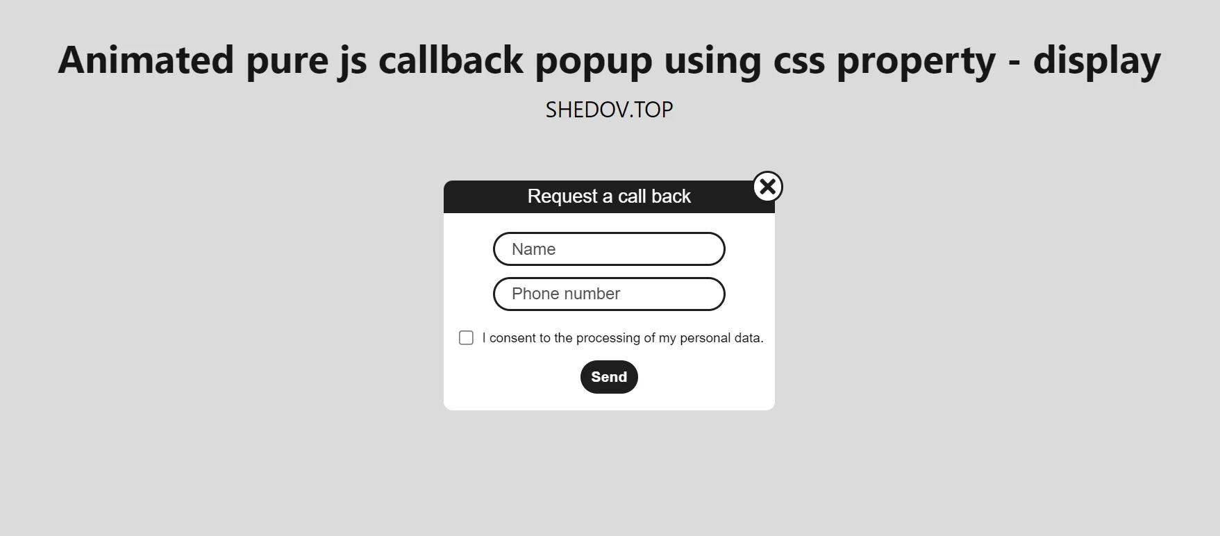
In this component, when creating an animation, onAnimationEnd is applied, as in this case. onAnimationEnd is the handler for the animationEnd event, which is called when the element's CSS animation ends. This component does not use third party libraries for animation and when the modal window is closed, it is not in the DOM.
App.jsx
import { useState } from "react";
import { Modal } from "./components";

function App() {

  const [showModal, setShowModal] = useState(false);

  return (
    <div className="App">
      <button
        onClick={() => {
          setShowModal(true);
        }}
      >
        Open modal
      </button>
      <Modal
        buttonShowModal={showModal}
        setButtonShowModal={setShowModal} />
    </div>
  );
}
export default App;
Modal.jsx
import {
  useState,
  useEffect,
  useRef
} from "react";
import {
  Horse,
  Close
} from "../../components";

import styles from "./Modal.module.css";

export function Modal({
  buttonShowModal,
  setButtonShowModal
}) {

  const [showModal, setShowModal] = useState(false);

  useEffect(() => {
    if (buttonShowModal) {
      setShowModal(true);
    }
  }, [buttonShowModal]);

  const [fadeOut, setFadeOut] = useState(false);

  // Click tracking outside the modal
  const modalRef = useRef();
  useEffect(() => {
    if (modalRef.current) {
      const handler = (e) => {
        if (!modalRef.current.contains(e.target)) {
          setFadeOut(true);
        }
      };
      document.addEventListener("mousedown", handler);
      return () => {
        document.removeEventListener("mousedown", handler);
      };
    }
  });

  return (
    <>
      {showModal && (
        <div
          className={
            fadeOut
              ? `${styles.modal_wrap} ${styles.modal_wrap__fade_out}`
              : `${styles.modal_wrap}`
          }
          onAnimationEnd={(e) => {
            if (e.animationName === styles.fadeOut) {
              setFadeOut(false);
            }
          }}
        >
          <div
            ref={modalRef}
            className={
              fadeOut
                ? `${styles.modal} ${styles.modal__fade_out}`
                : `${styles.modal}`
            }
            onAnimationEnd={(e) => {
              if (e.animationName === styles.fadeOut) {
                setShowModal(false);
                setFadeOut(false);
                setButtonShowModal(false);
              }
            }}
          >
            <Horse />
            <div
              onClick={() => {
                setFadeOut(true);
                setButtonShowModal(false);
              }}
              className={styles.close_button}
            >
              <Close />
            </div>
          </div>
        </div>
      )}
    </>
  );
}
Modal.module.css
.modal_wrap {
  display: flex;
  justify-content: center;
  align-items: center;
  background: rgba(0, 0, 0, 0.069);
  position: fixed;
  width: 100%;
  height: 100%;
  animation: fadeInModalWrap 0.5s forwards;
  opacity: 0;
  left: 0;
  top: 0;
}

.modal_wrap__fade_out {
  animation: fadeOut 0.5s forwards;
  opacity: 1;
}

@keyframes fadeInModalWrap {
  from {
    opacity: 0;
  }

  to {
    opacity: 1;
  }
}

@keyframes fadeOut {
  from {
    opacity: 1;
  }

  to {
    opacity: 0;
  }
}

.modal {
  width: 100%;
  max-width: 260px;
  display: flex;
  justify-content: center;
  align-items: center;
  height: 250px;
  border-radius: 5px;
  position: relative;
  animation: fadeInModal 0.8s forwards;
  background-color: rgb(255, 255, 255);
  margin-right: 15px;
  margin-left: 15px;
}

.modal__fade_out {
  animation: fadeOut 0.5s forwards;
}

@keyframes fadeInModal {
  from {
    opacity: 0;
  }

  to {
    opacity: 1;
  }
}

.close_button {
  position: absolute;
  right: 5px;
  top: 5px;
  border: 2px solid rgb(90, 90, 90);
  cursor: pointer;
  border-radius: 3px;
}

.close_icon {
  fill: rgb(90, 90, 90);
  width: 18px;
  height: 18px;
  transition: all 300ms ease;
}

.close_icon:hover {
  transform: rotate(360deg);
  transition: all 300ms ease;
}Share


Comment on