Animated heart with realistic heartbeat and hover effect, built with pure CSS
October 8
upd: October 8
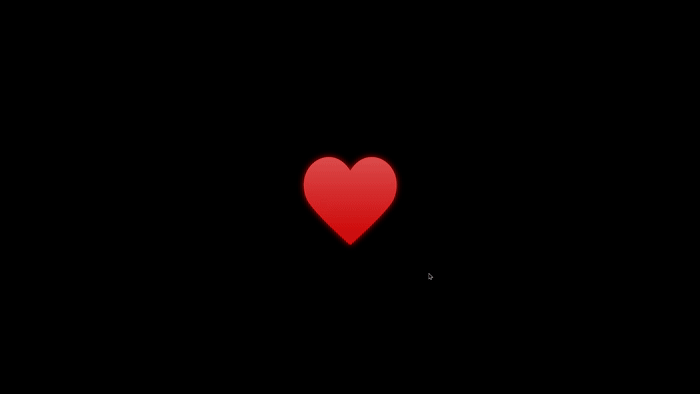
The heart was created using a combination of HTML, CSS, and the built-in capabilities of SVG animation.
Heartbeat
The main “heartbeat” effect (pulsation) is implemented purely with CSS.
— Technology: the animation property in CSS.
— How it works: the element
<svg class="heart">
uses two keyframes:
heartbeatSlow (slow beat, by default)
and heartbeatFast (fast beat, on hover).
These keyframes apply transform: scale(...)
to smoothly change the SVG heart’s size — expanding and contracting over time,
creating a realistic pulse effect.
— Hover effect (:hover):
when hovering over the heart (.heart:hover),
the animation switches from heartbeatSlow to
heartbeatFast,
making the pulse faster and more energetic.
Gradient
The color transition of the heart is handled directly inside the SVG using SMIL (Synchronized Multimedia Integration Language) animation.
— Technology:
the <animate> element inside SVG.
— How it works:
– A gradient is defined with
<linearGradient id="heartGradient">.
– Inside each gradient stop (<stop>),
there’s an <animate> tag that continuously
changes the stop-color attribute
(for example: #db4f4f → #ff0000 → #db4f4f)
over a 1.8-second cycle (dur="1.8s").
— Result: the heart doesn’t just pulse — it also changes its shade, becoming brighter (more red) at the peak of each beat, adding realism and depth.
Glow on Hover
The glowing effect on hover is achieved using a CSS filter.
— Technology:
the filter: drop-shadow(...) property.
— How it works:
by default, .heart has a subtle glow
(drop-shadow(0 0 5px rgba(255, 0, 0, 0.8))).
When hovered (.heart:hover),
the glow smoothly intensifies to
drop-shadow(0 0 15px rgba(255, 0, 0, 0.8)).
index.html
<!DOCTYPE html>
<html lang="en">

<head>
  <meta name="robots" content="noindex, nofollow" />
  <meta charset="UTF-8" />
  <meta name="viewport" content="width=device-width, initial-scale=1.0" />
  <title>Animated heart with realistic heartbeat and hover effect, built with pure CSS</title>
  <link rel="icon" type="image/png" href="favicon.png">
  <link rel="stylesheet" href="./style.css" />
</head>

<body>
  <div class="wrap">
    <div class="heart_wrap" aria-hidden="true">
      <svg class="heart" viewBox="0 0 32 32" xmlns="http://www.w3.org/2000/svg">
        <defs>
          <linearGradient id="heartGradient" x1="0%" y1="0%" x2="0%" y2="100%">
            <stop offset="0%" stop-color="#db4f4f">
              <animate attributeName="stop-color" values="#db4f4f;#ff0000;#db4f4f" dur="1.8s"
                repeatCount="indefinite" />
            </stop>
            <stop offset="100%" stop-color="#cc0000">
              <animate attributeName="stop-color" values="#cc0000;#ff3030;#cc0000" dur="1.8s"
                repeatCount="indefinite" />
            </stop>
          </linearGradient>
        </defs>
        <path
          d="M26.996 12.898c-.064-2.207-1.084-4.021-2.527-5.13-1.856-1.428-4.415-1.69-6.542-.132-.702.516-1.359 1.23-1.927 2.168-.568-.938-1.224-1.652-1.927-2.167-2.127-1.559-4.685-1.297-6.542.132-1.444 1.109-2.463 2.923-2.527 5.13-.035 1.172.145 2.48.788 3.803 1.01 2.077 5.755 6.695 10.171 10.683l.035.038.002-.002.002.002.036-.038c4.415-3.987 9.159-8.605 10.17-10.683.644-1.323.822-2.632.788-3.804z"
          fill="url(#heartGradient)" />
      </svg>
    </div>
  </div>
</body>

</html>
style.css
* {
  margin: 0;
  padding: 0;
}

body {
  background: #000000;
}

.wrap {
  display: grid;
  align-items: center;
  justify-content: center;
  height: 100vh;
}

.heart_wrap {
  width: 190px;
  height: 190px;
}

.heart {
  animation: heartbeatSlow 1.3s infinite ease-in-out;
  transform-origin: 50% 50%;
  transition: all 0.3s ease-in-out;
  filter: drop-shadow(0 0 0px rgba(255, 0, 0, 0));
  cursor: pointer;
}

.heart:hover {
  animation: heartbeatFast 0.85s infinite cubic-bezier(0.55, 0.05, 0.4, 0.95);
  filter: drop-shadow(0 0 15px rgba(255, 0, 0, 0.8));
}

/* slow heartbeat */
@keyframes heartbeatSlow {
  0% {
    transform: scale(1);
  }

  14% {
    transform: scale(1.16);
  }

  28% {
    transform: scale(1);
  }

  42% {
    transform: scale(1.1);
  }

  70% {
    transform: scale(1);
  }

  100% {
    transform: scale(1);
  }
}

/* fast heartbeat */
@keyframes heartbeatFast {
  0% {
    transform: scale(1);
  }

  15% {
    transform: scale(1.12);
  }

  30% {
    transform: scale(1.25);
  }

  45% {
    transform: scale(1.1);
  }

  60% {
    transform: scale(1.22);
  }

  80% {
    transform: scale(1.05);
  }

  100% {
    transform: scale(1);
  }
}
Share
BTC (Network BTC) - 1C2EWWeEXVhg93hJA9KovpkSd3Rn3BkcYm
Ethereum (Network ERC20) - 0x05037ecbd8bcd15631d780c95c3799861182e6b8


Comment on