Animated dropdown menu in React using — onAnimationEnd
August 12, 2023
upd: February 6
2.2K
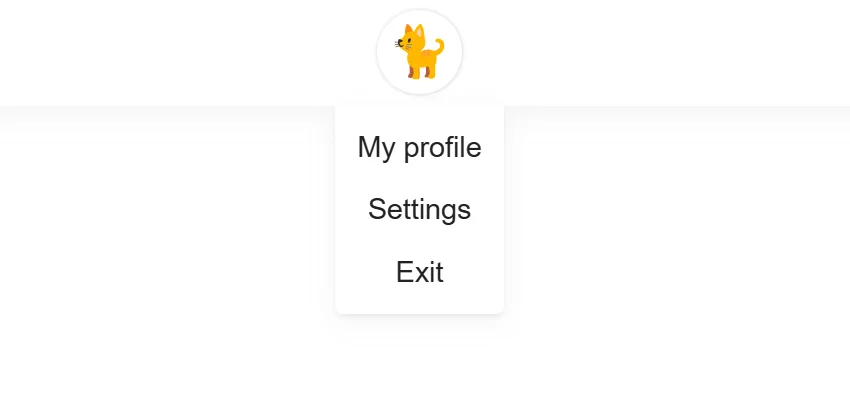
In this component, when creating animation, onAnimationEnd is used. onAnimationEnd is a handler for the animationEnd event, which is called when the CSS animation of an element ends. This component does not use third-party libraries for animation and when the menu is closed, it is not in the DOM.
App.jsx
import { Menu } from "./components";

function App() {

  return (
    <div className="App">
      <Menu />
    </div>
  );
}
export default App;
Menu.jsx
import {
useState,
useEffect,
useRef
} from "react";
import { Kitten } from "../../components";
import styles from "./Menu.module.css";
export function Menu() {
const [showMenu, setShowMenu] = useState(false);
const [fadeOut, setFadeOut] = useState(false);
const buttonShowMenu = (visibility) => {
if (visibility) {
setShowMenu(true);
} else {
setFadeOut(true);
}
};
// Click tracking outside the menu
const menuRef = useRef();
useEffect(() => {
if (menuRef.current) {
const handler = (e) => {
if (!menuRef.current.contains(e.target)) {
setFadeOut(true);
}
};
document.addEventListener("mousedown", handler);
return () => {
document.removeEventListener("mousedown", handler);
};
}
});
return (
<div className={styles.menu_wrap}>
<button
onClick={() => buttonShowMenu(!showMenu)}
>
<Kitten />
</button>
{showMenu && (
<div
ref={menuRef}
className={
fadeOut
? `${styles.menu} ${styles.menu__fade_out}`
: `${styles.menu}`
}
onAnimationEnd={(e) => {
if (e.animationName === styles.fadeOut) {
setShowMenu(false);
setFadeOut(false);
}
}}
>
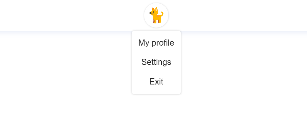
<ul className={styles.menu_list}>
<li>My profile</li>
<li>Settings</li>
<li>Exit</li>
</ul>
</div>
)}
</div>
);
}
Menu.module.css
.menu_wrap {
  width: 100%;
  max-width: 200px;
  margin-right: 15px;
  margin-left: 15px;
}

button {
  margin-left: auto;
  margin-right: auto;
  margin-top: 7px;
  margin-bottom: 7px;
  width: 50px;
  height: 50px;
  display: flex;
  justify-content: center;
  align-items: center;
  color: #222;
  box-shadow: rgb(0 0 0 / 18%) 0.2px 0.2px 2.5px;
  border-radius: 50%;
  background-color: rgb(255, 255, 255);
  transition: all 250ms ease;
  cursor: pointer;
  border: none;
}

@media (min-width: 1000px) {
  button:hover {
    transition: all 250ms ease;
    box-shadow: rgb(0 0 0 / 18%) 0.3px 0.3px 4px;
  }
}

.menu {
  width: 100%;
  max-width: 100px;
  left: 0;
  right: 0;
  margin: auto;
  border-bottom-right-radius: 5px;
  border-bottom-left-radius: 5px;
  border-top-left-radius: 0px;
  border-top-right-radius: 0px;
  position: absolute;
  animation: fadeIn 0.3s forwards;
  opacity: 0;
  background-color: rgb(255, 255, 255);
  box-shadow: 0 4px 16px rgb(132 134 136 / 9%), 0 2px 2px rgb(138 140 143 / 10%);
}

.menu_list li {
  display: flex;
  justify-content: center;
  align-items: center;
  font-family: Arial, Helvetica, sans-serif;
  font-size: 17px;
  color: #222;
  cursor: pointer;
  transition: all 300ms ease;
  height: 25px;
  margin-top: 12px;
  margin-bottom: 12px;
}

@media (min-width: 1000px) {
  .menu_list li:hover {
    transition: all 300ms ease;
    color: #545454;
  }
}

.menu__fade_out {
  animation: fadeOut 0.3s forwards;
  opacity: 1;
}

@keyframes fadeIn {
  from {
    opacity: 0;
  }

  to {
    opacity: 1;
  }
}

@keyframes fadeOut {
  from {
    opacity: 1;
  }

  to {
    opacity: 0;
  }
}Share


Comment on